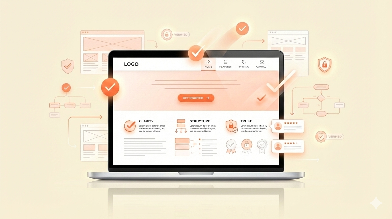
Businesses often assume that better design automatically leads to better results — sharper visuals, stronger colors, bigger hero sections, more animations. But conversions rarely improve because of “beautiful design” alone. Customers don’t make decisions based on decoration. They make decisions based on clarity.
People convert when the information is simple, structured, and trustworthy.
They take action when the website feels easy to understand.
They feel comfortable when they know exactly what to do next.
This is the psychology behind customer decision-making online — and it explains why clarity consistently outperforms aesthetics.
How People Really Make Decisions Online
The way visitors behave on a website is very different from how business owners imagine it.
People don’t arrive ready to explore.
They arrive with a question.
They skim. They scan. They look for meaning quickly. Their eyes move fast, and their attention shifts even faster. In the first 5–7 seconds, a visitor has already formed a strong impression about whether your website is relevant, trustworthy, or worth staying on.
This behavior comes from a simple truth:
The brain avoids effort.
If understanding your message requires work — reading long paragraphs, navigating complex layouts, interpreting vague headlines — the brain chooses the easier path: leaving.
Visitors don’t announce their confusion. They don’t send feedback.
They just disappear.
This is why clarity is so powerful. When your website removes mental friction, visitors stay longer, feel more confident, and move naturally toward action.
Why Clarity Outperforms “Beautiful” Design
A visually impressive website can still fail if the message is unclear. Great design matters — but only when it supports understanding.
Beautiful without clarity = frustration.
Visitors feel impressed for a moment, then confused.
Clear but simple = trust.
Visitors feel grounded, informed, and guided.
Many websites prioritize creativity over communication. They focus on visuals, not clarity. They add more colors, larger typography, animations, gradients — but none of these solve the visitor’s real problem:
“Help me understand quickly.”
True conversion-focused design isn’t the loudest — it’s the clearest.
A clean, structured layout with simple language and a guided flow almost always performs better than a highly decorative website. Because clarity doesn’t just look good — it reduces cognitive load, which makes the visitor feel safe.
And safety is what drives action.
The Psychology Behind High-Converting Websites
You don’t need to be a psychologist to understand why clarity works. The principles behind strong conversion are simple and deeply human.
1. Cognitive Ease
Information that is easy to process feels more true, more credible, and more trustworthy.
If your website feels simple to understand, people trust your business more.
2. Processing Fluency
Clear headings, predictable layouts, and clean spacing help the brain digest information quickly.
The easier it is to understand, the more likely someone is to act.
3. Choice Reduction
When people have too many options, they freeze.
A focused homepage with one or two clear CTAs outperforms pages with six different directions.
4. Visual Consistency
Aligned typography, color use, and spacing create subconscious trust.
Inconsistent design triggers hesitation — even when the visitor can’t explain why.
5. Predictability
Familiar patterns (such as headings, short sections, logical order) help people feel in control.
When a website feels predictable, it feels safer.
These psychological principles explain why clarity has such a strong impact on conversions.
When understanding becomes effortless, decision-making becomes faster.
How Clarity Guides Customer Behavior
Clarity shapes every part of the user journey — from the headline to the final CTA.
When your message is simple, visitors know what to do. When it’s not, they wander or leave.
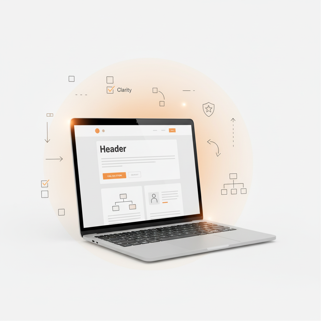
Clear Headings = Faster Understanding
A direct headline instantly tells visitors they’re in the right place.
There’s no guessing, no interpreting, no mental work.
Simple CTAs = Stronger Action
“Get Started,” “View Services,” “Book a Call.”
Short, simple CTAs reduce decision fatigue.
Clean Sections = Guided Navigation
Visitors follow structured content naturally.
They feel like they’re being led — not left to figure things out.
Minimal Text = Higher Engagement
Visitors read more when the content feels breathable and scannable.
Logical Flow = More Confidence
When the homepage unfolds like a conversation, trust builds quickly.
Clarity doesn’t just help visitors understand your website — it helps them feel understood.
The Cost of Confusion
When clarity is missing, conversions drop quietly.
Visitors don’t complain. They don’t send emails saying, “I couldn’t understand your homepage.”
They simply hesitate — and hesitation is enough to lose them.
Confusion creates doubt.
Doubt creates friction.
Friction kills action.
A confusing or overloaded website often leads to:
- Lower engagement
- Shorter time on page
- Fewer calls or inquiries
- Lower trust
- Higher bounce rates
None of these happen because the business is weak — they happen because the website asks too much from the visitor.
Clarity as a Competitive Advantage
The online space is crowded with websites that are “pretty” but hard to understand. This creates a quiet opportunity: clarity becomes a competitive advantage.
A clear website feels more premium.
A structured message feels more professional.
A predictable layout feels more trustworthy.
Most businesses focus on design as decoration.
Few focus on design as communication.
And that difference is exactly why clarity wins.
When your website communicates simply and confidently, you instantly stand out. Customers reward businesses that make their decision-making easier.
Final Thoughts
Clarity removes friction.
It builds trust.
It guides action.
A clear, structured website will always convert better than one that is visually impressive but hard to understand. When your message is simple and your design supports it, customers feel more comfortable choosing your business.
Clarity isn’t the opposite of design — clarity is good desi
Work With Adra Creative
Every website performs better when clarity leads the design. When your message is simple, your layout is structured, and your visuals support understanding, customers feel more confident — and more willing to take action.
At Adra Creative, this is how we approach every website we build.
We care about the message, the flow, the psychology, and the experience — not just the visuals. If you want a modern website that communicates clearly and guides visitors with confidence, we’d be happy to help.
